We sat down with Nicholas Rosaci, interior design expert and upcoming speaker at the 2019 GTA Home & Reno Show, to talk décor trends and learn how to incorporate this vibrant hue into our home for the upcoming year.
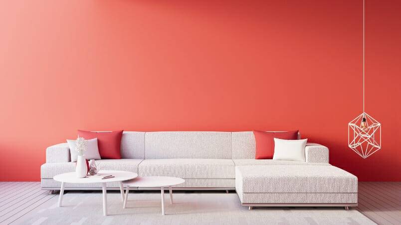
Coral is beautiful and earthy. a much-anticipated arrival on the tails of the “Pink” scene – a coveted colour of choice lately. However, unlike a pure Pink – which can appear childlike and Barbie mansion-esque – Pantone’s “Living Coral” is a little more grown up without losing any of the juicy energy of its Pink counterpart.
“Coral is a surprisingly versatile colour,” says Rosaci. “Coral can stand alone on its own while also acting as a great accent to existing neutrals like sand beige, jute and taupes. Its gold undertones naturally and luxuriously pair well with gold hardware accents and most would be surprised by how beautifully modern Living Coral looks when incorporated with more modern grey trends. Living Coral really warms up cool grey and looks especially chic with chrome and glass.
Rosaci believes in using colour everywhere, but especially in entryways or dining rooms places where you really want to create an impression and call for drama.
Entryway

In the foyer, try painting the front door both inside and out, and perhaps look for a great up-cycled project like a vintage chest of drawers painted the same shade, or a touch lighter or darker for contrast.
Dining Room

“Formal Dining rooms should be decorated for glamorous evenings,” says Rosaci. “The simple addition of silk drapery in a Living Coral shade adds a shimmering warm elegance to a space.” Try upping your design game with a deep emerald green room with gorgeous coral silk drapery, trimmed in a black and white Greek key trim detail.
Den
In the Den, explore painting the interior back of your cabinets or bookshelves in the hue, or using hints of the colour in all kinds of artwork, throw cushions and other decorative accessories.
Kitchen

Coral in the Kitchen can really kick up your decor a notch. Warm, inviting and unexpected, the colour works well with a plethora of wood options, tableware and accessories. “The colour pairs well with tropical palm leaf fabrics, which really liven up a tired kitchen for an instant tropical vibe,” says Rosaci. “You can even just add a little warmth with coral upholstered bar chairs to go with a white, modern kitchen.”
Bedroom

Try popping a few coral pillow cases into your existing grey bed sheets and watch it instantly look refreshed, revitalized and inviting. Unlike Orange, Living Coral works beautifully with black. “Every room should have an accent of black to draw the eye in,” says Rosaci. “With coral, the look is very soothing and not as jarring as black and orange – which can look like a Halloween décor ad.”
Lastly, even as a winter trend, Living Coral looks especially glamorous with winter white and faux fur while still being a colour that transitions well into the spring and summer. Ahh yes – Summer – it may not be here yet, but Pantone’s new colour of the year Living Coral certainly reminds us that warmer days are only a paint brush away.
Come check out Nicholas Rosaci at the 2019 GTA’s Home & Reno Show on February 15 – 18th to learn more design tips and tricks from the finest design experts in the city.
Contributor Jane Lee jane@punchcanada.com


